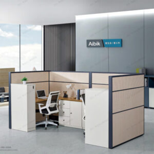
How to match the color of the office to make people feel comfortable and improve work efficiency?
Professor Zhang Qiman, doctoral supervisor of environmental art design major of Central Academy of fine arts, said that there are a lot of knowledge about color matching in the office, and the unity of color is the basic principle, and in the same color, there should be rich levels, even if it is the same color, there should be changes in depth. In an office, the color from top to bottom should be from light to deep, as if the lightest color in nature is the white clouds in the sky, and the deepest color is the black soil.
In addition, the color of the office should be different according to the room, people and function. When matching the color of the office, the following four aspects can be considered:
Choose the color matching of the office according to the nature of the work
The nature of the staff’s work is an important factor to be considered when designing colors. For example, light colors should be used in offices where staff are required to work carefully and steadfastly, such as scientific research institutions; offices that need active thinking and often discuss with each other, such as creative planning departments, should use bright, bright and jumping colors as embellishments to stimulate employees’ imagination 。
According to the space area, choose the color matching of the office
The office with a small area but very high height is easy to feel empty and cold. In order to adjust the uncomfortable feeling brought by the building itself, you can choose dark office furniture. Dark color belongs to the suppression of color, can make people have a sense of contraction, can reduce the office open and cold, and the ground must also use dark color, avoid top heavy. And relatively low office suitable for the use of a more elegant light color, because light color can make people have a sense of expansion, so that the office is significantly higher. With light blue, light green to do the color of the wall are good, but it is best not to use beige, because Beige makes people feel sleepy, if there is dust, it will appear old-fashioned.
According to the sunlight matching office lighting
Sunny offices can make people happy, while some offices are shady or even have no windows at all, which can make people feel cold and rely on artificial light sources. Therefore, such an office is best not to use cold colors, but to use brick red, Indian red, orange and other colors, which can make people feel warm. And the wall must not use the color with strong reflective ability, otherwise it will make the employee’s eyes tired due to light stimulation, no spirit, and virtually reduce the work efficiency.
Choose the color matching of the office according to the position of the staff
The color used in the office of a unit should not only be consistent as a whole, but also consider the difference of local color to distinguish the different levels of employees. For example, the desks of ordinary employees in a company are light gray, and the seats are dark red, which is not only a lively ornament in the whole cold color, but also can make the leaders clearly see which employee is not in the seat; the office desks of the middle-level and senior management personnel of the company are wood grain brown, but the seats of middle-level managers are blue-gray, while those of senior managers are blue-gray The seat of the member is black, more dignified and authoritative.
The above is mainly from the use of the scene, space area, lighting and staff positions of these four angles to talk about the color matching of the office.
Of course , the traditional office furniture in usa color style is also popular.
Or you may visit our youtube channel at: https://www.youtube.com/results?search_query=weiss+office+furniture
